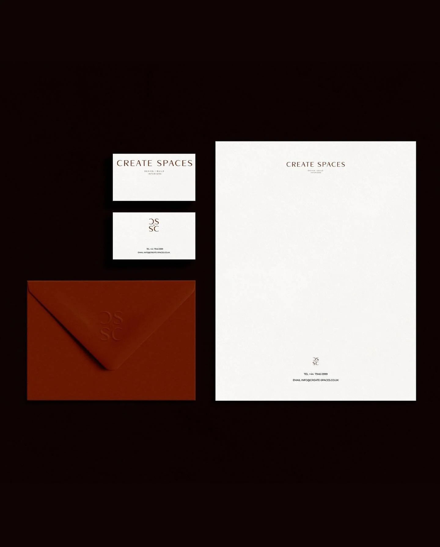
Shaanti
( SERVICES )
Branding + website
TIMELINE - 5 WEEKS
-
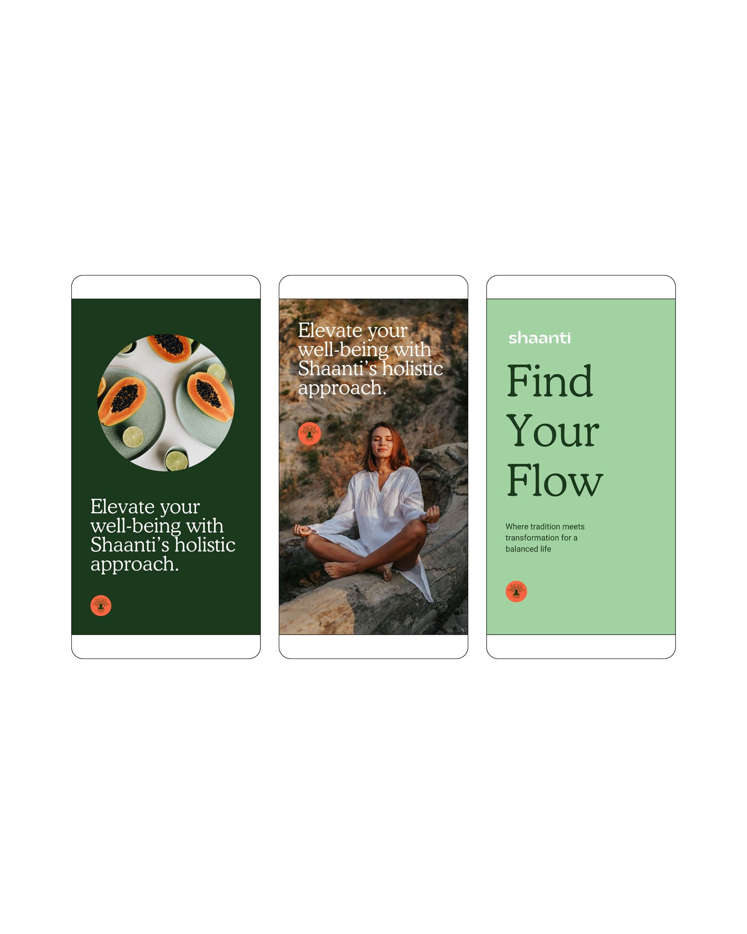
Shaanti is a holistic wellness platform that combines the ancient principles of Ayurveda and modern science to help you find joy and peace in your busy life. They were a startup looking to execute their brand identity within a short period of time so they could start building their website and eventually their own app. We executed their brand identity in just 2 weeks via our branding intensive service.
-
Our challenge was to create a brand that was at once calming yet vibrant. We chose the colour orange because it represents optimism and energy, whilst green provokes feelings of freshness and creativity and when paired with a darker green tone, the palette maintains a sense of sophistication. Our challenge was to help them stand out in a saturated wellness market in a way that communicated their brand values and stayed true to who they are as a business.
With a focus on typography, we chose contrasting yet complimentary fonts that when paired together, gave a completely unique look and feel to their brand. We chose one main brand colour and paired it with a range of neutral colours as to not take away from the focus on the type and imagery of the brand.
We designed a fun and young brand mark that is slightly obscure to attract a young demographic of professionals and to add a little edge to the brand. We also designed a more classic version of their logo by using a thin and elegant font with a bolder one to create further contrast and to put an emphasis on the word ‘career’. Finally, we designed a set of brand icons to be used throughout their branding that were inspired by the shapes of the letters in their brand mark, tying the whole identity together.
Central to our efforts was the creation of a distinctive brand mark. We achieved this by introducing bespoke customizations to the letter V, softening its shape and fashioning a memorable symbol that customers could readily recall and instantly associate with The V Spot.


(Testimonial)
"It was a pleasure working with Siena. We wanted a colourful minimalist design inspired by nature, and the final branding, design, feel and vibe was exactly what we had in mind. Every iteration was very thoughtful and on point in the colloborative process followed by detailed feedback sessions. Thanks to a well-scheduled process in advance, everything was delivered on time and as expected."
Join the newsletter
Follow along @hutch_co_design
Follow along @hutch_co_design